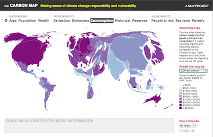
Today sees a mini trio of launches. Robin Houston and I have just published our Carbon Map, a website that explores climate change responsibility and vulnerability using a newly developed type of interactive moving map. That site is the launch project of our new partnership, Kiln, which will explore the middle-ground between journalism, web development, data and graphic design. And the Guardian Datablog team have used the site to launch their own new project – a Google-sponsored data visualisation series called Show And Tell.
I’ll write more about Kiln and the Carbon Map later when I have more time, but for now here’s a brief summary of some of the things we were trying to do with the map:
Create a new way of visualising national-level data that’s both more legible and more pleasing to interact with than boring old choropleths (shaded maps).
Create an intuitive way to view two layers of data simultaneously – one using country sizes and one using shading – to see how they relate.
Pull together the most comprehensive collection of data on national contributions to climate change, including past emissions; current emissions, measured at the points of extraction, combustion and consumption; and possible future emissions. This required quite a lot of manual gap filling and estimation for smaller countries, but I hope the resulting data is interesting and useful. I’ll make the spreadsheet available once I’ve tidied it up with explanations and so on.
Showcase some climate vulnerability data, which as a rule doesn’t get as much of a look-in as emissions data.
The original impetus for creating the Carbon Map was the World Bank’s Apps for Climate competition. We’ve entered and there’s a Popular Choice Award as well as a judging process, so if you like the site we’d be hugely grateful if you could vote for us. Voting opens on April 1 and I’ll post the link here then.
