Carbon Map update

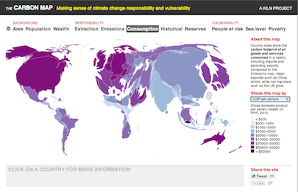
It’s now a few weeks since we published the Carbon Map and we’ve been thrilled with the response. So far we’ve had around 100,000 views, 5,000 shares (including the Guardian version), dozens of suggestions and offers of data, and write-ups in locations as diverse as Brazil, France and US. We’ve heard from teachers who want to use the site in classrooms from Scotland to India, academics who want to reproduce some of the maps in a journal article, and an organisation that may want to commission a whole new site.

Best of all, though, have been all the lovely tweets and comments, including a few from members of the public encouraging us to do more to make data easy to understand. Here’s my favourite:

As someone who never grips with graphs or lists of numbers, I wanted to drop into your bit of the ether to say thank you for creating your wonderful carbon map [and] for making important information more inclusive.

It’s also been nice to see tweets from cartography and infographic experts who have grudgingly liked our approach:

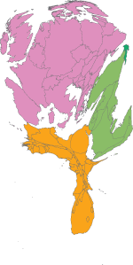
Normally don’t like this kind of #cartogram but something about watching it change is cool. (William McNulty‏, Director of Maps at National Geographic Magazine)

So, all in all a really pleasing response. Thanks to everyone who’s been in touch.

Posted in Uncategorized | Leave a comment

Introducing Kiln and the Carbon Map

Today sees a mini trio of launches. Robin Houston and I have just published our Carbon Map, a website that explores climate change responsibility and vulnerability using a newly developed type of interactive moving map. That site is the launch project of our new partnership, Kiln, which will explore the middle-ground between journalism, web development, data and graphic design. And the Guardian Datablog team have used the site to launch their own new project – a Google-sponsored data visualisation series called Show And Tell.

I’ll write more about Kiln and the Carbon Map later when I have more time, but for now here’s a brief summary of some of the things we were trying to do with the map:

  1. Create a new way of visualising national-level data that’s both more legible and more pleasing to interact with than boring old choropleths (shaded maps).

  2. Create an intuitive way to view two layers of data simultaneously – one using country sizes and one using shading – to see how they relate.

  3. Pull together the most comprehensive collection of data on national contributions to climate change, including past emissions; current emissions, measured at the points of extraction, combustion and consumption; and possible future emissions. This required quite a lot of manual gap filling and estimation for smaller countries, but I hope the resulting data is interesting and useful. I’ll make the spreadsheet available once I’ve tidied it up with explanations and so on.

  4. Showcase some climate vulnerability data, which as a rule doesn’t get as much of a look-in as emissions data.

The original impetus for creating the Carbon Map was the World Bank’s Apps for Climate competition. We’ve entered and there’s a Popular Choice Award as well as a judging process, so if you like the site we’d be hugely grateful if you could vote for us. Voting opens on April 1 and I’ll post the link here then.

Posted in Climate, Data, Emissions, Energy, Kiln | Tagged , | Leave a comment

Catching up

Having abandoned this blog for a couple of months, I thought I should quickly write a catch-up post to justify the interruption in service and get myself back into the swing of things. So although I don’t really approve of all-about-me diary-style blogging, here goes anyway.

  • A new book. I was busy in January writing a proposal for new book to be coauthored with Mike Berners-Lee, whose previous book I commissioned and edited. We want to write something that will be fun to read and which explores the whole issue of energy and climate change from a zoomed-out, big-picture perspective. Imagine a combination of Freaknomics and David MacKay’s Without Hot Air. The book has now been commissioned by Profile Books, where I used to work, and will come out in due course. If you have any overlooked big-picture insights into climate, energy and how the whole issue fits together then do get in touch. Mike and I gave a talk about the book at the UCL Energy Institute last week and it was great to have such a receptive crowd and so many offers of help. Many thanks all you UCL folks.

  • Data journalism. I’ve been trying to do more data-focused journalism at the Graun of late. Recent examples are these articles on fossil fuel reserves and UN negotiation positions, fossil fuel subsidies and this map of global responsibility for climate change. My inner geek is massively drawn to data journalism and I’ve been enjoying doing stories like these, though it’s amazing how long it can take to crunch the numbers sometimes. I’m keen for more ideas and sources, so do let me know if you have any good unexplored datasets.

  • New nuclear. I spent a while researching integral fast reactors and their current PRISM incarnation for this story about what we could theoretically do with the UK’s plutonium stockpile. The piece, and George Monbiot’s analysis that ran alongside it, generated lots of interest and – perhaps inevitably – a crop of highly critical letters from anti-nuclear green groups. I haven’t had time to reply to the letters yet, though it struck me reading them that none of the letters addressed Monbiot’s simple question (i.e. “what is the best way to get rid of the waste we have”), nor the fact that all the perspectives in my piece came from David MacKay, who green groups usually treat as an infallible source when he’s talking about renewables. My own view – like MacKay’s – is that these reactors are worth properly evaluating, though I still think thorium molten-salt nuclear is a more attractive proposition – not least because it doesn’t require potentially dangerous sodium as a coolant and it promises to be even more meltdown-proof than IFRs. Unfortunately molten salt reactors are further from being commercially viable.

  • 10:10. I haven’t been doing as much at 10:10 recently, though I did recently pitch our crowd-funding Solar Schools project to NESTA who selected it as one of the projects they will be supporting through their Innovations in Giving Fund. Thanks NESTA! Speaking of Solar Schools, the pilot has been doing really well, with the first school putting up its solar panels up the week before last and plenty of others not far behind.

[Writing those two bullet points adjacently reminds me that I’ve been meaning to post something on how odd it seems that most people interested in climate change seem determined to slag off either solar or new nuclear, as if the two were mutually incompatible.]

  • Ultimate Climate Change FAQ. I’ve been motoring ahead with this project, with help from the Grantham Institute, Met Office and others. If you have expertise in any climate change topic and would like to submit an answer to a question we haven’t yet covered, then please do drop me a line, as it’s very much as a collaborative effort. And helpful yourselves to the content, most of which is released under a Creative Commons license.

  • Consultancy stuff. I’ve been advising M&S recently on their carbon cutting work. I mention this partly because it’s proving an interesting experience and partly because I think anyone who does journalism should be transparent about any consultancy work they do, to avoid any potential conflicts of interest.

  • Kiln. In between our day jobs, Robin Houston and I have been developing some interesting data visualisation stuff which we will be unveiling in a couple of weeks. The earth will move, quite literally. Watch this space.

I’ll stop there to avoid descending into complete tedium, but now that catch-up is out of the way, hopefully I’ll find time to start posting again properly soon.

Posted in Climate, Energy, Media, MinorMass, Uncategorized | Tagged , , , , , , | Leave a comment

Australia and Czech Republic join the race to create nuclear energy from thorium

I’ve written quite a few times for the Guardian about liquid fluoride thorium energy: first we introduced it as part of the Manchester Report; then we noted when China got excited about the technology. Next we reported on the launch of a new thorium pressure group and US company, and the other week I posted a brief background guide to the technology to go alongside a news update about a different type of thorium nuclear plant in India.

The latest development, according to a press release I just received, is the announcement of an Australian–Czech consortium that, it turns out, has been working for years on developing a liquid fluoride reactor (also known as a “lifter” or molten salt reactor) and plans to start moving into the engineering phase as soon as next year.

Australia doesn’t currently have any nuclear power generation (despite huge uranium reserves), so I wonder whether the new-found enthusiasm for thorium there may partly be a way of restarting the conversation about nuclear in the country on different terms. The fact that Australia is estimated to have the world’s biggest thorium deposits may also be a factor.

Interestingly, the newly announced project is one of the first to publish it’s expected price tag. The prototype is scheduled to cost $A300 million. Phil Joyce, a spokesperson for the consortium, said about the project:

We have been working with the Czech Republic now for some six years to move beyond the Research & Development stage. However, it took the Fukushima disaster to raise awareness and create an understanding of the urgency which exists in finding a safe alternative for base-load power.

Researchers in the Czech Republic are world leaders in thorium technology and this development would not be possible without the dedication and support of Czech governments over the years.

The time for planning and building thorium fuelled base-load energy plants has come and we are looking forward to developing the first working model that will be connected to the grid.

So … the race is really now on. The Chinese, Americans, Australians, Czechs – and the Russians, I was told the other day – are all eagerly trying to be the first to develop a working liquid thorium reactor. I wonder who will win.

Posted in Energy, Resources | Tagged , | Leave a comment

Spotting the second spring

My Guardian colleague Juliet Jowitt wrote the other day about nature being fooled into a ‘second spring’ by the warm autumn. This morning I saw an almost spooky manifestation of that phenomenon: an ornamental cherry tree in east London in full blossom, still with its turning autumn leaves. Something rather apocalyptic about it.

Update, 28 November: People who know more about ornamental trees than me have pointed out on Facebook that this may just be a winter-flowering cherry tree. I’m embarrassed to admit that I didn’t know such things existed. Nonetheless, I’ve fairly sure I’ve never seen any cherry tree with quite that combination of turning leaves and full blossom. In fact, I first noticed it because quite a few people on the street were pointing to it and discussing it.

Anyway, apologies if this is in fact nothing unusual. Can anyone confirm? Either way, in my defence, note that scientists are observing very strange things this November, including spring blossoms. A few extracts from Juliette’s report the other day:

This year earlier-than-ever autumn colours and fruits have been mixed with prolonged signs of summer wildlife such as dragonflies, butterflies and grass snakes, and spring flowers such as magnolia, apple blossom and honeysuckle blooming – making it a truly extraordinary season …

The Centre for Ecology and Hydrology reported that some spring species recorded their earliest appearance since records began in the late 1700s – and a poor summer and drought in parts of the country are all thought to have played a part …

There is some debate among experts, however, about whether they are witnessing a second spring or if next year’s has come early. “I think what’s happened is that that very warm, late spell in October has really fooled a few things into thinking spring’s turned up early again – forgetting the fact they haven’t had a winter,” said Bullock [of the Wildfowl and Wetlands Trust] …

A paper led by the Centre for Ecology and Hydrology, published in 2010, analysed 25,000 trends for 726 species and calculated that on average seasonal events were occurring 11 days earlier than a generation ago.

Posted in Natural World | Tagged , | Leave a comment

Making sense of climate targets

Just posted a Guardian backgrounder on climate targets, as part of our big FAQ project.

It was interesting to write – not just to clarify a few details for myself, but also to realise quite how hard it is to source reliable information on this stuff. Even the IPCC reports don’t make it crystal clear whether they’re talking about concentrations of greenhouse gases or greenhouse gases minus aerosol cooling. And lay-friendly writes up regularly confuse CO2 with CO2e, fudge baselines for emissions cuts, and so on.

Anyway, thanks to the Met Office for fact checking it – and if anyone finds it useful, feel free to repurpose it. Like most of the FAQ answers, it’s released under a Creative Commons license.

Posted in Climate, Emissions | Tagged | Leave a comment